How to Blend Opposing Interior Design Styles
Image via Victoria Gerts Interiors
As an interior designer, there are numerous aspects of my work that bring me pure joy, such as that first inspirational Pinterest board I create for clients, finding that unique piece of décor that will tie the design together, the excitement I see in my clients’ eyes on the final reveal.
My role is to bring your vision to life and create a blissful space that serves your family and reflects your style. With that being said, no one ever told me that the one role I would have to take on eventually is... the Mediator.
Most people have a general understanding of what their design preferences are. Whether you lean towards a classic Art Deco glamour or have a serious obsession with rustic charm, all it takes is one consultation and an elaborate Pinterest board to narrow it down.
But what happens when my client’s family members all have opposing styles? How can we put Hollywood Regency and Scandinavian minimalism together? Or Mid-Century Modern and urban farmhouse style? I know how it sounds... polar opposites!
But trust me, if there is one thing I’ve learned throughout the years, it’s that the key to a successful project is a mix of design prowess and a whole lot of creativity.
When faced with such a challenge, my go-to strategy is not necessarily to pick one design style over the other. Instead, I try to identify the complementary elements that can potentially be combined to bridge the styles through color choices, textiles, furniture silhouettes, and finishes.
Project Example:
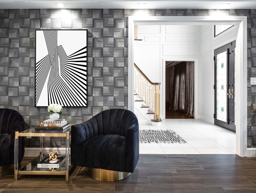
To help illustrate my point, I’ll be sharing this project, which I recently completed for a lovely couple with kids. Their home is the perfect example of contrasting yet balanced design styles. While one preferred regency and flamboyancy, the other had a preference for more modern minimalism and practicality.
For example...
Image via Victoria Gerts Interiors
How does the magic happen? Here’s how it works...
Step 1: Discover your design story
Every design tells a story. When you walk into a space, the layout, colors, textures, and art all combine to tell the tale of the people living in it and reflect their personalities and style. Families with opposing design preferences are no different. It might be more challenging — and fun! — for a designer, but it stands true.
The first step is always to work on discovering your design story. It is about capturing your personal narrative, such as where you’ve been, the lifestyle you live now, and where you want to go in the future. With design, we can bring all three aspects of you (and your family) into harmony.
My Process:
I always start by creating a Pinterest board and inviting the family to contribute to it. When people say a picture is worth a thousand words, it could not be truer! There are even times when family members do not realize how opposing their styles are until we build their vision board.
I suggest saving images of spaces that inspire them, color palettes they like, or any elements that would help us determine the design direction we’re taking.
To support the process, I also ask the family to fill out a questionnaire to get a bit more detail about their lifestyle and how they want the space to serve them.
Then, we schedule a meeting. I consider it to be the most important step in our process, which is why I always emphasize having every single member of the household present, even the little ones. The purpose of it is not only for them to express their goals and preferences in terms of design, but also to make sure everyone has the same expectations.
Even though it is quite rare to have a family agree on everything, having everyone on the same page leads to a harmonious design process.
Step 2: Bridge the design styles
Now that we’ve established your design story and the different styles your family members are leaning toward, it is time to establish a strategy. There are several ways to tackle such a project and find a compromise. I like to focus on two elements:
Mixing styles
This might come as a surprise to you, but people tend to opt for “pure” design styles less and less often these days. Most homes are a blend of several different styles or eras. The way I proceed is by showing you a few examples of mixed styles and design elements and highlighting how the juxtaposition of colors and textures can create harmony.
My main goal is to create a space that the eyes and the mind will view as a whole, as opposed to a forced synergy.
Project Example:
A great example is the following bathroom design. While one spouse wanted a timeless glamour in the master bathroom, the other was looking for a down-to-earth mood. We bridged the two for a result that is simply gorgeous...
Image via Victoria Gerts Interiors
The star feature of this master bathroom is this gorgeous floor-to-ceiling porcelain tile with intricate veining. The space is additionally elevated with touches of glamour, such as the lucite cabinet hardware, gondola-shaped tub, and glass and chrome lighting — two svelte sconces and a show-stopping chandelier. Proof that two contrasting styles can be a match made in heaven!
For natural balance, we selected stone-carved vessel sinks with “live-edge” texture, organic-shaped river pebbles for the shower and the room’s perimeter, ebony wood grain tile, and warm satin bronze finish on the plumbing fixtures.
Image via Victoria Gerts Interiors
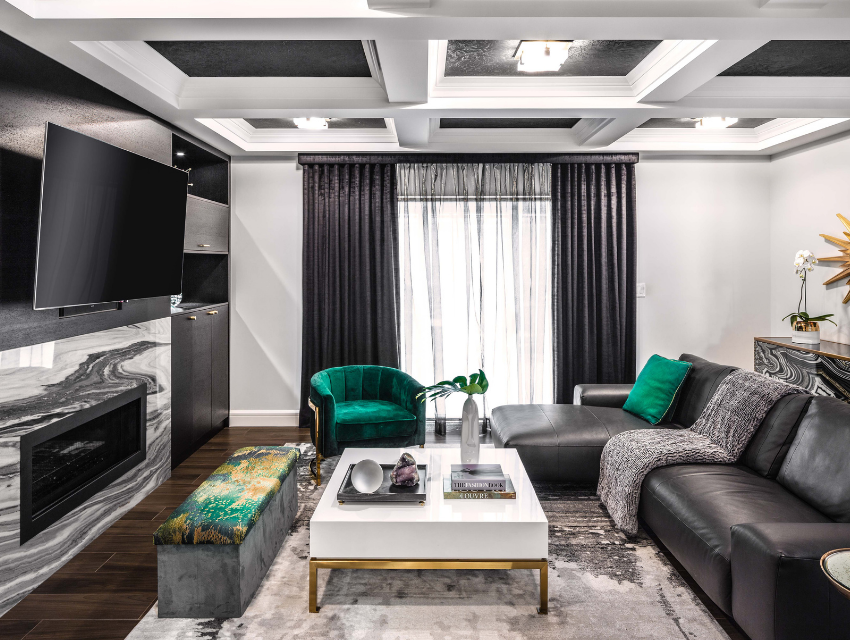
We took the same approach in the couple’s living room. Again, we have dark, moody tones for our base, and you can see evidence of natural stone in this fireplace surrounding and in the agate-inspired cabinet. Meanwhile, brushed brass accents (the coffee table and chair frame), pops of rich emerald, and subtly shimmering drapery uplevel the glamour.
Step 3: Create designated his and hers spaces
In addition to bridging design styles in the whole home, I also look at whether there is a particular space where each partner spends most of their time. If one is always found in the library while the other spends most of their time in the kitchen, I would incorporate more of their respective style elements in their favorite spots… while keeping it harmonious with the style and rhythm of the whole home, of course!
Image via Victoria Gerts Interiors
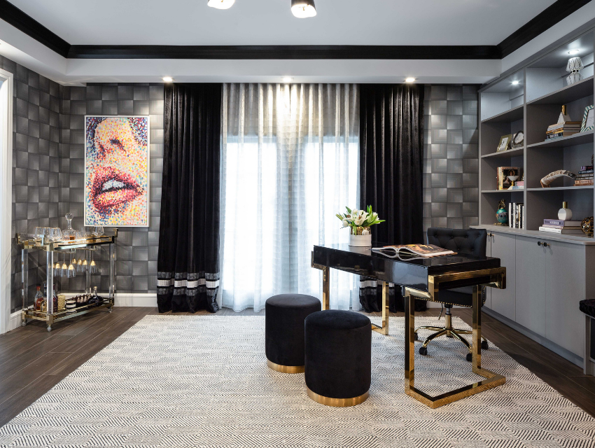
This is the inside of the sophisticated home office you saw at the beginning of this post. The room is mostly used by the wife of the couple, and therefore leans more toward her glamorous design style.
Although this room looks and feels different from the other spaces in the home, it is a perfect example of the repetition necessary to keep a home feeling cohesive. The wallcovering and rug repeat the motif of geometry. The use of lucite (also seen in the bathroom) is found again in this chic bar cart (which every home office needs!). Touches of warm brass, luxurious velvet, and cool-toned natural wood flooring are the final touches that unify the design with the rest of the home.
Final Thoughts
When crafting intricate ways to mix your family’s styles and come up with design combinations, it is very important for me not to lose sight of the bigger picture… crafting a blissful space where you and each member of your family will feel happy, comfortable, and fulfilled.
Blending and juxtaposing differing design elements takes practice, but it makes all the difference… to the final design and to the way you live.
If you work with me, we will create a space that will witness your happiest of moments, where you can create a lifetime of memories. To do that, I take pride in making sure every single member of your household loves their newly designed home.
What about you? What story do you want your home to tell? How do you want it to feel each and every day? Get in touch with me here, and I’d love to help!
Yours,
Victoria


