Fun & Functional
Your child deserves a fun and functional bedroom. Here’s how you do it...
Hi guys, happy Friday!
I hope you all had a fantastic and productive week.
I am back home after an amazing trip to Florida, where I was enjoying a little time relaxing, as well as doing what I love most: interior design.
My question for you today, is this: Have you ever wondered how to create a fun, yet practical, space for your child?
I’ve come across this creative challenge many times, as a parent. So, today I’d like to share some exciting, inspiring – but most importantly useful – ideas for your kids’ spaces, alongside some of my ‘top tips’ for creating functional and stylish children’s rooms.
You can have it all! A space that’s fun for the kids, practical to use, and stylish in the home
To show you my approach, here’s a project that we wrapped up recently...
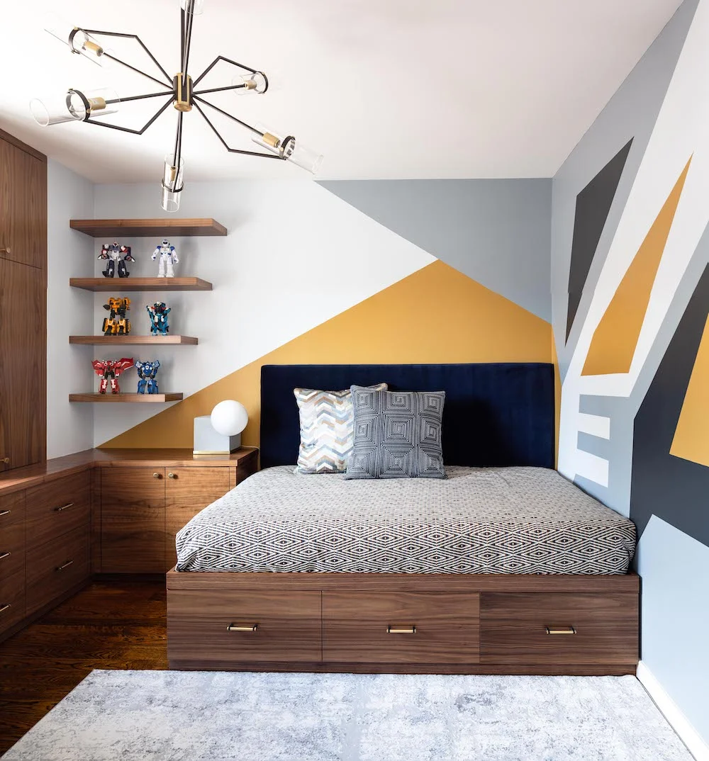
This room belongs to a six year old boy, who loves sports and play dates with his friend – like many six year olds out there, I’d assume!
But this little boy’s true passion is Transformers – and everything related to them.
He owns a biiiig collection of Transformers toys, which – understandably! – had to be incorporated in our design approach and, in honesty, really became our main source of visual inspiration for the design concept. You’ll see later on in the post how we selected geometric fabrics and finishes to subtly, and stylishly, pay homage to the Transformers franchise.
Just so you know: I’ll talk more in-depth the inspiration and design concept in a future post – so watch this space! – but today it’s all about practical solutions.
So let’s dive in...
When I met with this boy’s mother for the first time, she briefed me on two really important factors to consider in her son’s bedroom redesign:
The biggest priority – to have lots of storage; so Mom can store away and hide all the toys and miscellaneous belongings this typical young boy has in his room.
And secondly, to have lots of storage so Mum has a place for all his school stuff, such as exercise books, reading texts, pens and paper.
No, you didn’t read that wrong...
Both her highest priorities were regarding extra storage!
Dear Moms out there: are you feeling like you can relate?! Haha!
I could definitely understand how this young mother felt, and was ready to do my very best to accommodate her wishes.
And this is how I did it: first things first, a floor plan…
I always start each project with a rough floor plan sketch. At this stage, I am thinking about both space planning and concept at the same time; they are so interconnected, you can’t figure one out without the other.
And knowing that storage was the name of the game here, I came to a decision that a built-in furniture system would be the best solution.
Why?
Well, kids’ bedrooms are rarely big, and this room was no different – with just 130 square feet to play with, I was determined to use every square inch available. I wanted to create as much storage space as possible, but also to make this “real estate” practical and fun for a growing child.
To achieve this, I designed a smart and stylish built-in system, incorporating a desk, lower storage cabinets and drawers, upper cabinets, wall shelves and a bed with extra storage cabinets.
So far, so good: lots more storage to keep Mom happy!
And this seems like a good time to give you my first ‘top tip’ of the day:
Tip 1:
If you’re designing within a small or awkward-shaped space, built-in storage is a smart way to go. Where freestanding furniture would eat up much-needed space, built-in solutions allow you to maximize usable floor and wall space, and either hide or use tricky columns and niches.
But, of course, it wasn’t just Mom we were trying to keep happy with this redesign – we needed to create a playful space for the little boy to enjoy as well.
Because of its new layout, and positioning of built-in furniture, the room now felt bigger, with much more floor space.. For him, that meant more room to play with his toys – but also more room for friends, when they come to visit.
Socializing is very important for growing children, and you want a kid’s room to be able to adapt with them as they get older. So, we decided to make the space for a full-sized bed in the room, versus a single.
Whether a friend comes over for a playdate, or a sleepover – sleeping either in the bed, or on an air mattress on the floor – there’s plenty of space for them to have tons of fun... without having to make a mess anywhere else in the house!
Of course, this is a massive plus for Mom, as it limits mess beyond the boy’s bedroom walls.
But it also gives Mom a sense of long-term satisfaction – as there’s no need to redesign in the coming years. The interior design is more future-proofed; the layout will work just as well for him in ten year’s time, as it does today.
Moving to shelf storage, and creating a place for everything...
Okay, I love floating shelves! Do you?
Let me tell you a few things about floating shelves and I promise you will fall in love with them too.
First of all, this type of shelving has a neat, clean finish and will fit in pretty much any type of interior. Plus, floating shelves can be made of any kind of materials: wood, metal, lucite and etc., so they can always match your style.
Secondly, they are easily put up and down, because they are usually not attached to a wall themselves, but slide on a frame that is joined to the wall. So if you need to repaint the room, for example, it’s an easy task! Just slide off your shelf et voila!
For this room, we hung floating shelves on two walls.
Not only did this help give us more storage space, but they were also a great solution as we had a small obstacle to overcome: an existing air conditioning unit on the left side of the window, meaning closed cabinets were a no-go.
So floating shelves gave us the neat, clean look we were after, as well as troubleshooting in the space itself.
Then, to match the final esthetic, we displayed the boy’s books and personal objects on the shelves, and I added free standing soft storage baskets on the shelves for even more storage!
It looked great at first, but you’ve got to wonder how long a six year old boy will keep everything in its place...
Boys will be boys – how do you design a storage solution with a kid’s playful habits in mind?
Obviously, the way that adults and children use their spaces differs greatly.
Where you can expect (most!) adults to keep a space clean and tidy, you can’t always expect the same from a six year old, no matter how hard you try.
And it’s the big, bulky things that, when left lying around, quickly make a small space look cluttered.
With this in mind, wee intentionally built two large drawer cabinets on the left side of the desk – more on this desk space later! These two drawers could house larger size toys and other big objects. Very convenient!
But we didn’t stop there: Mom asked for more storage, so we added further drawer cabinets under the bed!
Tip 2:
Putting drawer cabinets under a desktop brings two important benefits. For one: it makes it easier for a child to take out/put back their toys. And two: these types of cabinets tend to be way more spacious, so they hold more items. What’s more, you don’t have to worry that a heavy drawer will fall out, because the frame of the cabinet is secured on a wall. At the end of the day, your child’s safety is the most important thing, so opt for under-desk cabinets where you can!
Kids’ bedrooms tend to be multi-purpose, so what else do you need to build in?
We’ve mentioned how important it is to create social space in a kid’s bedroom, but a child also needs the space to chill out and spend time on their own.
The spacious desk area we installed has enough room for comfortable study time, reading, arts & crafts and other, more down-tempo activities.
As I already said, a kid develops so quickly through their childhood and into their teen years. Whilst you might not think a deskspace is necessary for a six year old, if you want to avoid a bothersome redesign in the next few years, you’re better off putting one in place now.
Trust me: they’ll grow up faster than you ever expected!
And a desk doesn’t have to take up too much room, or be obtrusive in the room’s flow – you can see here how the desktop continues to an adjacent wall forming an L-shape. This part by the bed with an underneath cabinet is intended to be a convenient bedside table.
Last but not least, the final touches: fabric and finishes
If you know how I work, then you know that I like to finish each and every project in ultimate style.
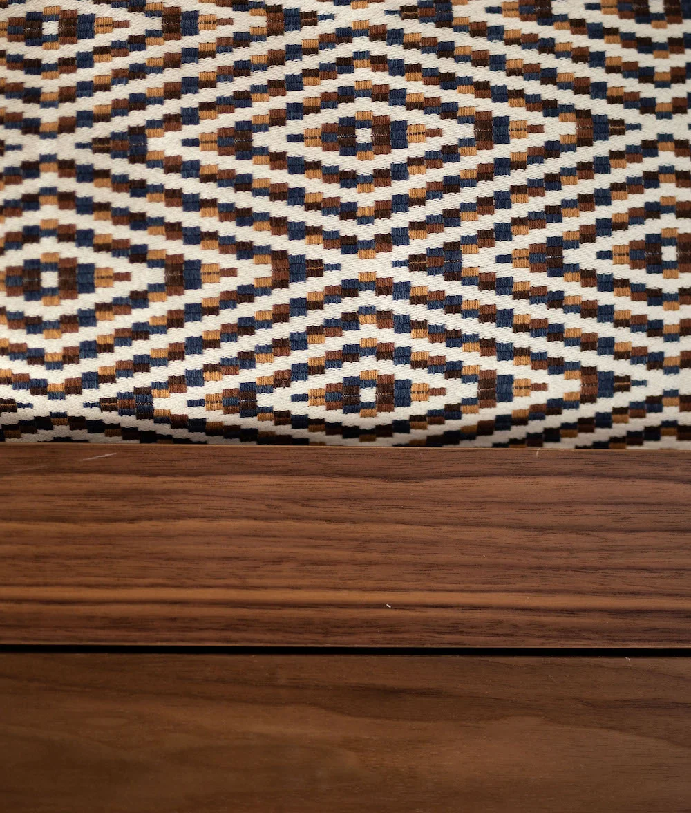
So, for this interior space, we chose to create the built-in system from an exquisite walnut.
We partnered with the masterful Avior G-Touchwood, Inc and I am so glad the woodworkers were able to bring our vision to life, with great care and finesse.
We selected the brass & oil-rubbed bronze cabinet hardware from Rejuvenation, to complement the brass-finish lighting and other decorative elements used in this space.
Beautiful!
Next: fabrics...
When it comes to fabric selection, I have a few ways to go about it. I recently posted about this on Instagram, if you want to take a look.
But where and how I start selecting interior fabrics totally depends on each individual project.
In this case, the fabric selection was based strictly on the project concept – and, as mentioned before, I promise to write you a full journal article all about project concepts very soon.
But back to this room: for two oversized decorative pillows, I used square maze-like stitched fabric and multi-colored embroidered chevron pattern fabric, which are Kravet Couture of Kravet Inc. Fabric House. The bed cover is embroidered diamond braid pattern Robert Allen fabric of Robet Allen & Duralee Fabric House, with a headboard that’s upholstered in stunning royal blue velvet Kravet fabric.
For the roman shade on the window we chose Jeffrey Alan Marks multi-colored light fabric of Kravet Inc. For contrast we repeated the same dark maze squares fabric on the vallance over the window shade.
And because no detail is ever spared, I used tasteful Samuel & Sons trims for the pillows and the window shade.
These fabrics with playful geometric shapes were specifically chosen to go along with the overall main design idea.
Together with other design elements and materials they help to tell a unique story and create an atmosphere both the little boy, and his Mom, can enjoy every day; helping them make precious memories in their beautiful family home.
So there you have it: how you design a kids’ space with functionality and fun, without compromising on style. It can be done!
Happy son, happy Mom, happy Victoria!
Do you have an interior design challenge ahead of you? Drop me a line today, I’d love to help you out.


